These functions build the three time-series charts used throughout the
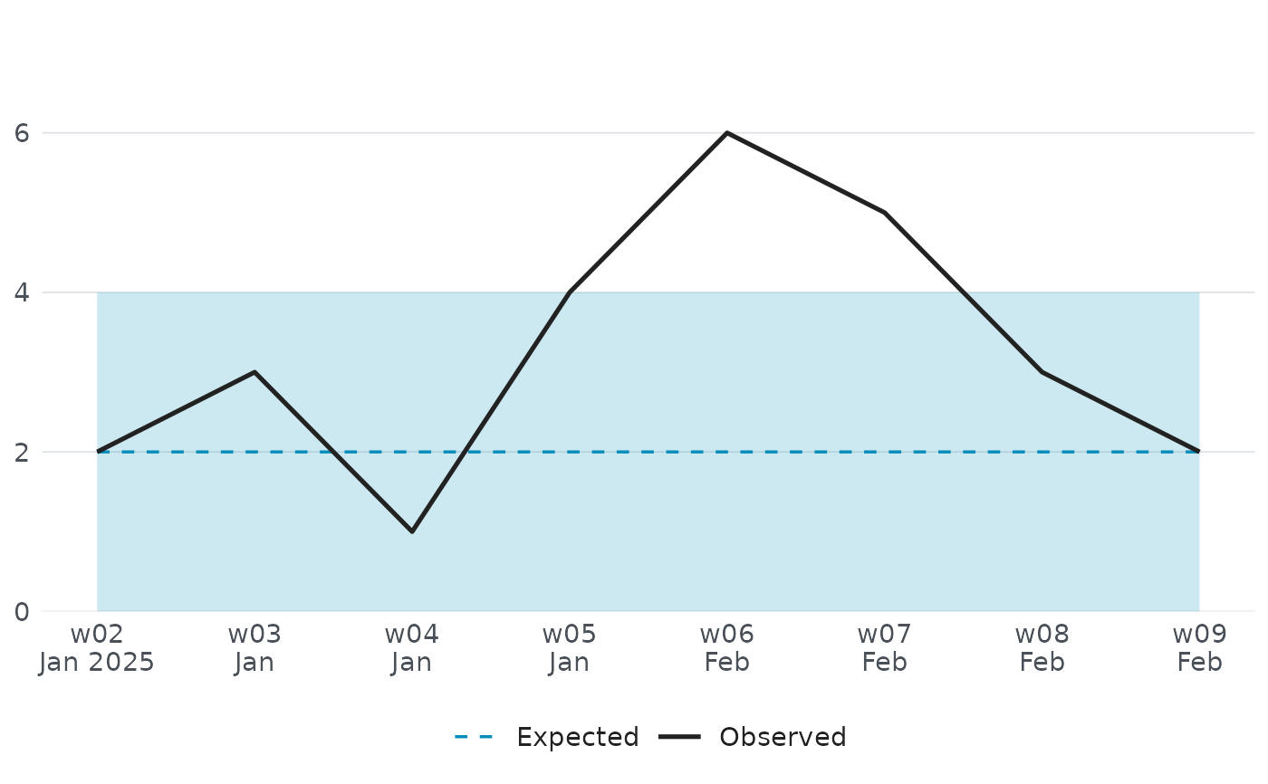
EpiSODIC dashboard and outbreak reports: an epidemic curve, a trend chart
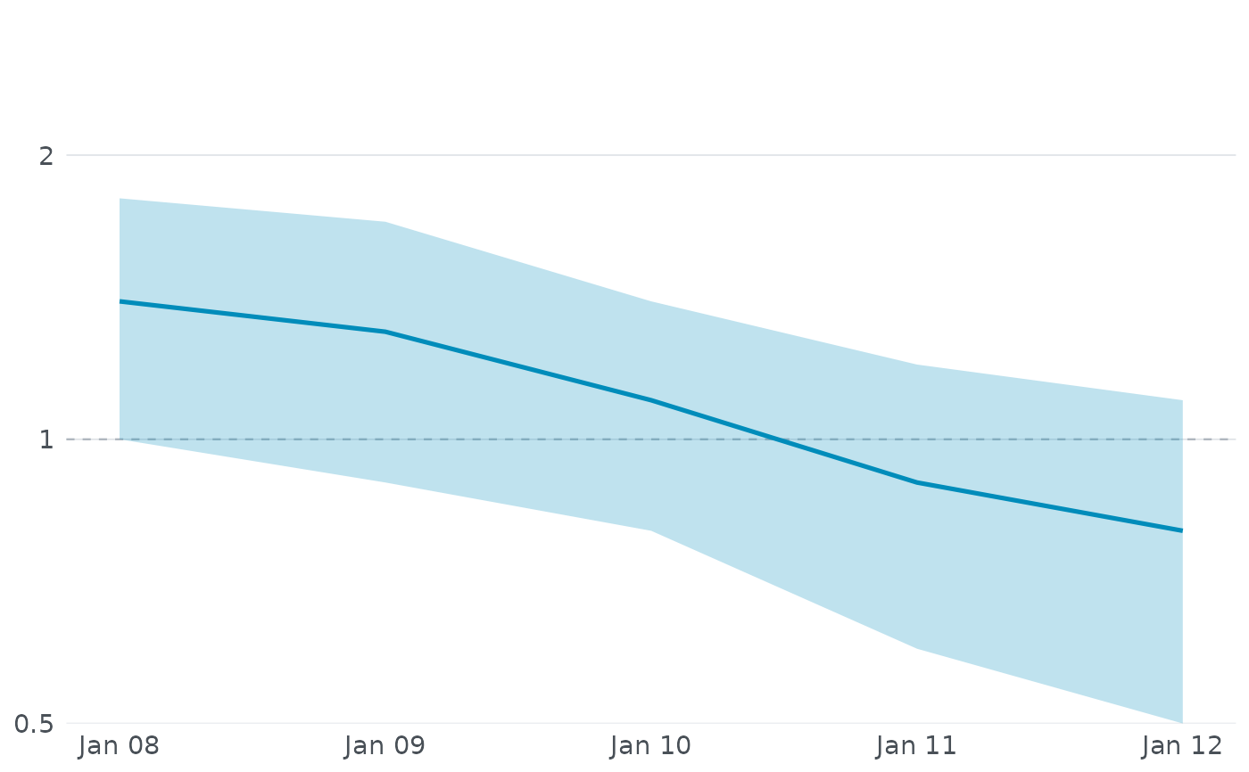
against the expected baseline, and an effective reproduction number
(\(R_t\)) chart. Each takes the small, already-summarised data frame the
app itself works with, so they are also useful for reproducing a dossier's
chart in your own report or presentation. All three return a static
ggplot2::ggplot object that can be printed, saved with
ggplot2::ggsave(), or further customised with additional ggplot2
layers.
Usage
episodic_ui_epi_curve_chart(
  curve,
  lang = Sys.getenv("EPISODIC_LANGUAGE"),
  accent = NULL
)

episodic_ui_trend_chart(
  trend,
  lang = Sys.getenv("EPISODIC_LANGUAGE"),
  accent = NULL
)

episodic_ui_rt_chart(rt, lang = Sys.getenv("EPISODIC_LANGUAGE"), accent = NULL)
Arguments
- curve
A data frame with one row per day:
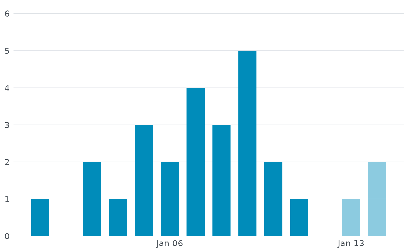
sample_date(Date),n_cases(case count), andincomplete(logical,TRUEfor the most recent day(s) where reporting is still catching up - these are drawn at reduced opacity as a visual reminder not to over-interpret a downturn that is really just a reporting lag). Optionallynowcast_low,nowcast_midandnowcast_high: the 5%, 50% and 95% quantiles of a day's expected final count once reporting is complete, drawn as a line with an open point at the median on the days that have them (NAelsewhere).- lang
Language for axis labels:
"en","ar","nl","fr","de","hi","zh", or"es", or a regional variant of one ("en-US","es-419"). Defaults to theEPISODIC_LANGUAGEenvironment variable, falling back to"en"if that is unset.- accent
Fill colour for the bars. Defaults to the palette's
primary, which every chart in the dashboard uses for its main series; the status colours are kept for marks that mean something (thresholds, positivity).- trend
A data frame with one row per week:
week_start(Date),n_cases(observed count),expected(the Farrington baseline), andupperbound(the alarm threshold, shown as a shaded band).- rt
A data frame with one row per estimation window:
window_end(Date),mean(point estimate of \(R_t\)), andlower/upper(95% credible interval). A dashed reference line is drawn at \(R_t = 1\), the threshold between a shrinking and a growing outbreak. The y axis is on a log2 scale, labelled in \(R_t\) itself, so that a halving and a doubling sit the same distance either side of that line.
Value
A ggplot2::ggplot object.
Examples
curve <- data.frame(
sample_date = seq(as.Date("2025-01-01"), by = "day", length.out = 14),
n_cases = c(1, 0, 2, 1, 3, 2, 4, 3, 5, 2, 1, 0, 1, 2),
incomplete = c(rep(FALSE, 12), TRUE, TRUE)
)
episodic_ui_epi_curve_chart(curve, lang = "en")
 trend <- data.frame(
week_start = seq(as.Date("2025-01-06"), by = "week", length.out = 8),
n_cases = c(2, 3, 1, 4, 6, 5, 3, 2),
expected = c(2, 2, 2, 2, 2, 2, 2, 2),
upperbound = c(4, 4, 4, 4, 4, 4, 4, 4)
)
episodic_ui_trend_chart(trend, lang = "en")
trend <- data.frame(
week_start = seq(as.Date("2025-01-06"), by = "week", length.out = 8),
n_cases = c(2, 3, 1, 4, 6, 5, 3, 2),
expected = c(2, 2, 2, 2, 2, 2, 2, 2),
upperbound = c(4, 4, 4, 4, 4, 4, 4, 4)
)
episodic_ui_trend_chart(trend, lang = "en")
 rt <- data.frame(
window_end = seq(as.Date("2025-01-08"), by = "day", length.out = 5),
mean = c(1.4, 1.3, 1.1, 0.9, 0.8),
lower = c(1.0, 0.9, 0.8, 0.6, 0.5),
upper = c(1.8, 1.7, 1.4, 1.2, 1.1)
)
episodic_ui_rt_chart(rt)
rt <- data.frame(
window_end = seq(as.Date("2025-01-08"), by = "day", length.out = 5),
mean = c(1.4, 1.3, 1.1, 0.9, 0.8),
lower = c(1.0, 0.9, 0.8, 0.6, 0.5),
upper = c(1.8, 1.7, 1.4, 1.2, 1.1)
)
episodic_ui_rt_chart(rt)